Dashboards provide an at-a-glance understanding of key metrics. Each dashboard contains one or more dashboard components and each component displays metrics from a report.
How to Create Dashboards
To create a new dashboard:
- From the Dashboard tab, click Create.
- In the Create Dashboard dialog, enter a Name for the dashboard and an optional Description.
- Select an option for combining dashboard prompts on run-time and click Continue to open the builder.
- Click Add Component and set options in the Add New Component dialog. Review the component settings for each chart type: Bar, Column, Combination, Control, Gauge, Line, Number, Pareto, Pie, and Table.
- Repeat the process to create as many components as you need to display on the dashboard. You can add up to 15 components.
- Rearrange components by clicking on the component and dragging it to the new location.
- Resize components by clicking the arrow in the bottom-right and dragging the component to your desired size. Vault allows up to three (3) components in a single horizontal row. For column, line, and control charts, Vault displays one data point per dashboard cell that the component covers.
- Click Save & Run.
Resizing Dashboards
Using Run-Time Inputs with Dashboards
Run-time inputs allow dashboard viewers to dynamically update a dashboard to show information most relevant to them. For example, a PromoMats organization uses a dashboard with components that measure average approval time and number of review cycles. This dashboard is shared across the organization, but individual users who access the dashboard can use run-time inputs to filter on specific products or therapeutic areas.
Vault remembers your filter settings when you leave and return to the dashboard. The same filter will be applied each time you rerun the dashboard. To change your filter preference, click the Edit icon next to Filters in the upper left of the dashboard window.
To use run-time inputs with dashboards, select a report with run-time inputs when creating a dashboard component. When running dashboards, users enter run-time filter values to use in the dashboards. You can enter a maximum of 100 run-time filter values.
The filter values are based on the associated prompt report filters. Users can also choose to skip optional filter prompts when configured.
Combining Dashboard Prompts
When creating a new dashboard, the Combine dashboard prompts by setting on the Create Dashboard dialog allows you to select how dashboard prompts are combined when a user runs the dashboard. The following options are available for the Combine dashboard prompts by setting:
- Prompt Label
- This option combines any filter prompts when the labels, data type, operator, and optional settings match exactly. For example, two charts on the dashboard have filter prompts labeled Department and use the equals operator, so Vault combines them into a single prompt and users will only select a Department once when running the dashboard. For underlying report filters that have the same defined Filter Alias, the Prompt Label option combines prompts using the Filter Alias. When creating a new dashboard, this option is selected by default.
- Referenced Field
- This option combines filter prompts that reference the same field and use the same operator. For example, the Study > Country in… and Document > Country in… prompts both reference the Country and use the in operator, so Vault combines them into a single prompt and users will only select a Country once when running the dashboard.
Note: When combining prompts in dashboards, Vault does not combine user reference fields with special user fields such as Workflow Owner, Task Owner, Last Modified By, or Created By.
How to Copy Dashboards
If you want to create a dashboard that shares components with another dashboard, you can copy the existing dashboard. You must be the dashboard’s owner or have the Editor role to copy.
To copy a dashboard:
- From the Dashboards tab or from inside a specific dashboard, click on the Actions menu and choose Make a Copy.
- Enter a Name and (optional) Description for the new dashboard.
- Click Continue.
- Make any necessary edits to the new dashboard. When finished, click Save or Save & Run.
How to Edit Dashboards
Only the dashboard owner, a user listed as Editor for the dashboard, or an Admin can edit a dashboard. To open edit mode, open the dashboard and click Edit. When finished, click Save or Save & Run. From edit mode, you can:
- Rename or edit the dashboard component by clicking by the dashboard name. Review the component settings for each chart type: Bar, Column, Combination, Control, Gauge, Line, Number, Pareto, Pie, and Table.
- Delete a dashboard component by clicking by the component name.
- Rearrange dashboard components by clicking on the component and dragging it to a new location in the dashboard.
- Add a new component by clicking Add Component.
- Expand and resize dashboard components by clicking the arrow in the bottom-right and dragging the component to your desired size. Vault allows up to three (3) components in a single horizontal row.
Note: Dashboard components display all data points if they are expanded across the width of the browser page. Otherwise, charts show only one data point per dashboard cell based on the width. For example, a chart expanded to a width of seven (7) cells shows seven (7) data points, and a chart expanded to 11 cells shows 11 data points. Charts may display the text Too many to display if there are more data points than Vault can display in the available space.
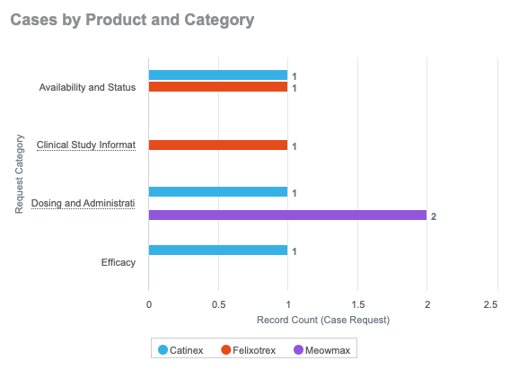
How to Create Bar Charts
To create a dashboard component that shows a bar chart:
- While in edit mode, click Add Component.
- Enter a Name for the component.
- Select a Report.
- On the Chart Data tab, select Bar as the chart type, if available. Vault determines the available chart types based on the data in the selected report.
- For X-Values (Metric), select a metric from the report to serve as the data for the chart. For Y-Axis (Category), select a field from the report to serve as the category. For Group By, select a field to group by within each category. Select Stacked, Grouped, or % Stacked as the Group Styling.
- On the Formatting tab, choose to show or hide the x- and y-axis labels. Modify the labels if needed. Select the Show Chart Values checkbox to display the exact value for each category or group after the bar. Select the Show Legend checkbox to display a legend below the chart. Enter a value for Target Line if you want to display a target value as a line on the chart.
- Optional: Add a Description (limited to 256 characters) and a Footer (limited to 128 characters). The description text is displayed under the Name of the chart, and the footer text is displayed at the bottom of the chart.
- Click Preview Report Data to preview the chart with data.
- Click Continue to add the new component to the dashboard.
This example shows a bar chart using the “Grouped bar” grouping style.
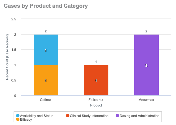
How to Create Column Charts
To create a dashboard component that shows a column chart:
- While in edit mode, click Add Component.
- Enter a Name for the component.
- Select a Report.
- On the Chart Data tab, select Column as the chart type, if available. Vault determines the available chart types based on the data in the selected report.
- For Y-Values (Metric), select a metric from the report to serve as the data for the chart. For X-Axis (Category), select a field from the report to serve as the category. For Group By, select a field to group by within each category. Select Stacked, Grouped, or % Stacked as the Group Styling.
- On the Formatting tab, choose to show or hide the x- and y-axis labels. Modify the labels if needed. Select the Show Chart Values checkbox to display the exact value for each category or group above the column. Select the Show Legend checkbox to display a legend below the chart. Enter a value for Target Line if you want to display a target value as a line on the chart.
- Optional: Add a Description (limited to 256 characters) and a Footer (limited to 128 characters). The description text is displayed under the Name of the chart, and the footer text is displayed at the bottom of the chart.
- Click Preview Report Data to preview the chart with data.
- Click Continue to add the new component to the dashboard.
This example shows a column chart using the “Stacked columns” grouping style.
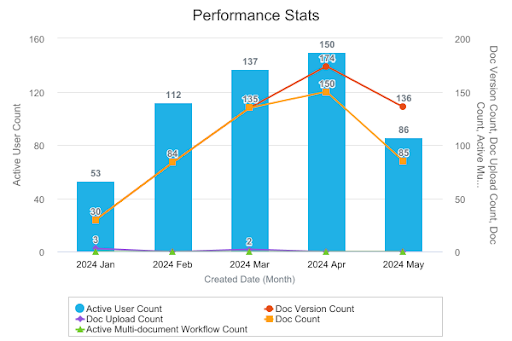
How to Create Combination Charts
Combination charts can display up to ten metrics, with one base metric and up to nine secondary metrics. You can configure the base metric to be displayed using a column chart, bar chart, or line chart. Secondary metrics are displayed as a line chart.
To create a dashboard component that shows a combination chart:
- While in edit mode, click Add Component.
- Enter a Name for the component.
- Select a Report.
- On the Chart Data tab, select Combination as the chart type, if available. Vault determines the available chart types based on the data in the selected report.
- Select Bar, Column, or Line for the Base Chart Type.
- Select the primary metric, category, grouping, and group styling settings. These settings depend on whether the selected base chart type is Bar, Column, or Line.
- Add a secondary metric to the y-axis.
- Optional: Add the secondary y-axis. All metrics on the secondary y-axis are displayed as line charts.
- Optional: Click the plus (+) icon and add an additional eight secondary metrics. Click the minus (-) icon to remove secondary metrics if needed.
- On the Formatting tab, select or deselect the checkboxes to show or hide the x-axis, y-axis, and secondary axis labels. Modify the labels if needed. Select the Show Chart Value checkbox to display the exact value for each category or group above the value. Select the Show Legend checkbox to display a legend below the chart. Enter a value for Target Line if you want to display a target value as a line on the chart.
- Optional: Add a Description (limited to 256 characters) and a Footer (limited to 128 characters). The description text is displayed under the Name of the chart, and the footer text is displayed at the bottom of the chart.
- Click Continue to add the new component to the dashboard.
This example shows a combination chart with columns for the primary metric and a line for a secondary metric.
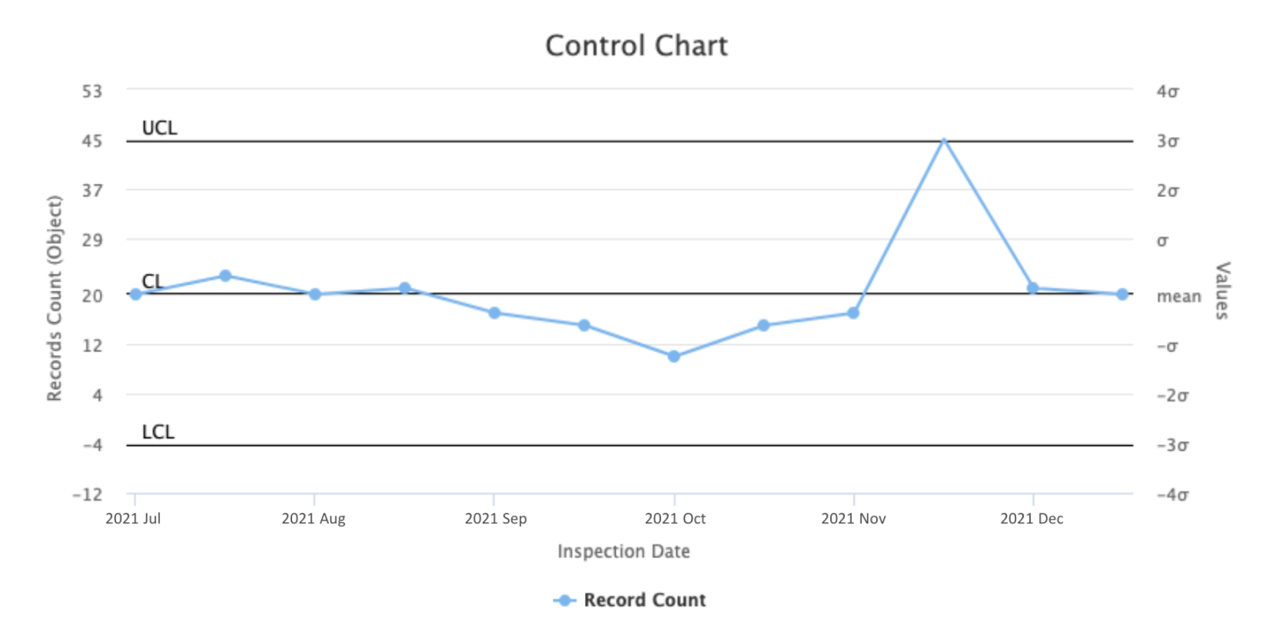
How to Create Control Charts
To create a dashboard component that shows a control chart:
- While in edit mode, click Add Component.
- Enter a Name for the component.
- Select a Report.
- On the Chart Data tab, select Control as the chart type, if available. Vault determines the available chart types based on the data in the selected report.
- For Y-Values (Metric), select a metric from the report to serve as the data for the chart. Vault performs all sigma calculations automatically. For X-Axis (Category), select a field from the report to serve as the category.
- On the Formatting tab, choose to show or hide the x- and y-axis labels. Modify the labels if needed. Select the Show Chart Values checkbox to display the exact value for each category or group above the data point on the line. Select the Show Legend checkbox to display a legend below the chart. Enter a value for the Target Line if you want to display a target value as a line on the chart.
- Optional: Add a Description (limited to 256 characters) and a Footer (limited to 128 characters). The description text is displayed under the Name of the chart, and the footer text is displayed at the bottom of the chart.
- Click Preview Report Data to preview the chart with data.
- Click Continue to add the new component to the dashboard.
This example shows a control chart.
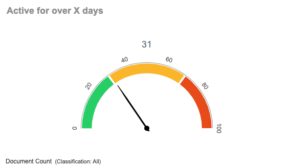
How to Create Gauge Charts
To create a dashboard component that shows a gauge chart:
- While in edit mode, click Add Component.
- Enter a Name for the component.
- Select a Report.
- On the Chart Data tab, select Gauge as the chart type, if available. Vault determines the available chart types based on the data in the selected report.
- Select a Metric from the report to serve as the data for the chart.
- For the Primary Grouping, select All Values or select a specific grouping from the drop-down. This option is only available for grouped reports.
- On the Formatting tab, enter the range of metric values to show on the chart. If you want the exact metric value to appear below the chart, select Display Actual Value and enter the unit label. Select the Display Metric Label checkbox to show the name of the metric in the chart. Select the Display Groupings checkbox to show details for the groupings applied to the chart. You can also add up to three colored bands to the chart by selecting a color and an end value for the band.
- Optional: Add a Description (limited to 256 characters) and a Footer (limited to 128 characters). The description text is displayed under the Name of the chart, and the footer text is displayed at the bottom of the chart.
- Click Continue to add the new component to the dashboard.
This example shows a gauge chart.
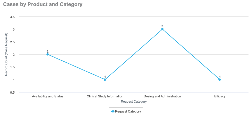
How to Create Line Charts
To create a dashboard component that shows a line chart:
- While in edit mode, click Add Component.
- Enter a Name for the component.
- Select a Report.
- On the Chart Data tab, select Line as the chart type, if available. Vault determines the available chart types based on the data in the selected report.
- For Y-Values (Metric), select a metric from the report to serve as the data for the chart. For X-Axis (Category), select a field from the report to serve as the category. For Group By, select a field to group by within each category, if available.
- On the Formatting tab, choose to show or hide the x- and y-axis labels. Modify the labels if needed. Select the Show Chart Values checkbox to display the exact value for each category or group above the data point on the line. Select the Show Legend checkbox to display a legend below the chart. Enter a value for Target Line if you want to display a target value as a line on the chart.
- Optional: Add a Description (limited to 256 characters) and a Footer (limited to 128 characters). The description text is displayed under the Name of the chart, and the footer text is displayed at the bottom of the chart.
- Click Preview Report Data to preview the chart with data.
- Click Continue to add the new component to the dashboard.
This example shows a line chart.
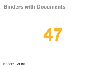
How to Create Number Charts
To create a dashboard component that shows a number chart:
- While in edit mode, click Add Component.
- Enter a Name for the component.
- Select a Report.
- On the Chart Data tab, select Number as the chart type, if available. Vault determines the available chart types based on the data in the selected report.
- Select a Metric from the report to serve as the data for the chart.
- For the Primary Grouping, select All Values or select a specific grouping from the drop-down. This option is only available for grouped reports.
- Optional: Select the % of Grand Total checkbox to display this chart as a percentage. This is only available if your metric is a sum or count and the chart shows a specific grouping.
- On the Formatting tab, enter a unit label for the number. If you want the number to show in a specific color, depending on the value, use the range selectors to choose a color and enter the start/end values for the range. The ranges must be in ascending order, meaning that Range 1 must be lower numbers than Range 2.
- Optional: Add a Description (limited to 256 characters) and a Footer (limited to 128 characters). The description text is displayed under the Name of the chart, and the footer text is displayed at the bottom of the chart.
- Click Continue to add the new component to the dashboard.
This example shows a number chart.
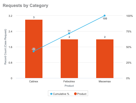
How to Create Pareto Charts
To create a dashboard component that shows a pareto chart:
- While in edit mode, click Add Component.
- Enter a Name for the component.
- Select a Report. Only reports with groups can be used for pareto charts.
- On the Chart Data tab, select Pareto as the chart type, if available. Vault determines the available chart types based on the data in the selected report.
- For Y-Values (Metric), select a metric from the report to serve as the data for the chart. For X-Axis (Category), select a field in the report to serve as the category. If the report has a single grouping, Vault uses it as the X-Axis (Category).
- On the Formatting tab, choose to show or hide the x- and y-axis labels. Modify the labels if needed. Select the Show Chart Values checkbox to display the exact value for each category or group above the column. Select the Show Legend checkbox to display a legend below the chart. Enter a value for Target Line if you want to display a target value as a line on the chart.
- Optional: Add a Description (limited to 256 characters) and a Footer (limited to 128 characters). The description text is displayed under the Name of the chart, and the footer text is displayed at the bottom of the chart.
- Click Preview Report Data to preview the chart with data.
- Click Continue to add the new component to the dashboard.
This example shows a pareto chart.
How to Create Pie Charts
To create a dashboard component that shows a pie chart:
- While in edit mode, click Add Component.
- Enter a Name for the component.
- Select a Report.
- On the Chart Data tab, select Pie as the chart type, if available. Vault determines the available chart types based on the data in the selected report.
- Select a Metric from the report to serve as the data for the chart. For Group By, select a field to group by within each category.
- On the Formatting tab, select the Show Category Labels checkbox to display the labels for each grouping category. Select Show Percentages to display the percentage for each grouping category. Select the Show Legend checkbox to display a legend below the chart.
- Optional: Add a Description (limited to 256 characters) and a Footer (limited to 128 characters). The description text is displayed under the Name of the chart, and the footer text is displayed at the bottom of the chart.
- Click Preview Report Data to preview the chart with data.
- Click Continue to add the new component to the dashboard.
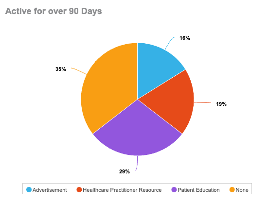
This example shows a pie chart.
How to Create Table Charts
To create a dashboard component that shows a table chart:
- While in edit mode, click Add Component.
- Enter a Name for the component.
- Select a Report. You can only select reports with a single grouping or no groupings for table charts.
- On the Chart Data tab, select Table as the chart type.
- Select a Column to serve the data in the table chart. If the report uses single-level grouping, the grouped field is automatically added to the chart and cannot be removed. If any columns in the report use aggregate functions, they also appear for selection in the Columns drop-down. If the report is ungrouped, all report columns are available for selection. You can select up to 10 columns to include in the table chart.
- Optional: Select Show record details on the Chart Data tab to view the report without any grouping and select the ungrouped columns. If this option is unselected, only the grouped field displays. This option is unavailable for ungrouped reports.
- Optional: On the Formatting tab, enter the Number of groups to display in the dashboard. You can display up to 200 groups. You can also select Show Report Name to display a link to the underlying report used in the component.
- Optional: Add a Description (limited to 256 characters) and a Footer (limited to 128 characters). The description text is displayed under the Name of the chart, and the footer text is displayed at the bottom of the chart.
- Click Continue to add the new component to the dashboard.
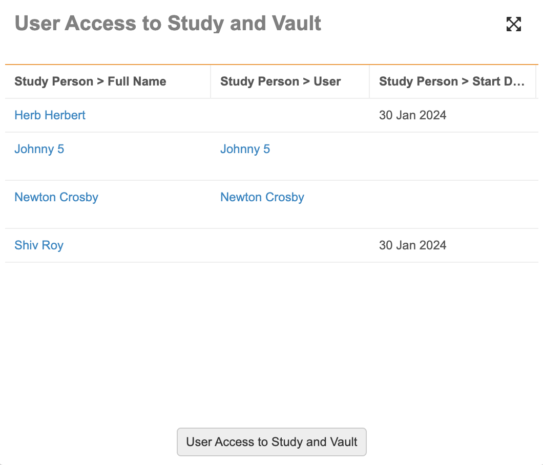
This example shows a table chart.
Note: Record count rows are displayed only if the total number of records in the report is less than the value in the Number of groups to display field.
Table Charts Demo
See below for a video tutorial on how to use table charts in Vault.
Report Limitations
- For Gauge and Number charts, you can use any report except a matrix report that groups on a Date or DateTime field. For other charts, you can use any report that uses grouping, but not a report that is ungrouped.
- Reports that use Show as % as a grouping option cannot be used on dashboards.
- A single dashboard supports a maximum of 15 charts.
- Vault allows up to three (3) components in a single horizontal row on a dashboard.
- You can enter a maximum of 100 filter values for run-time filters.
The following table indicates which chart types are supported for various report formats:
| Report Format | Gauge | Number | Table | Combo | Line | Bar | Column | Pie | Control | Pareto |
|---|---|---|---|---|---|---|---|---|---|---|
| No Grouping | X | X | X | |||||||
| Grouped by Date Field Without Period Selected | X | X | X | X | X | X | X | X | X | X |
| Grouped by Date Field With Period Selected | X | X | X | X | X | X | X | X | ||
| Grouped by One Non-Date Field | X | X | X | X | X | X | X | X | X | X |
| Grouped by Multiple Fields | X | X | X | X | X | X | X | X | X |